For a Growing Church, Reinvention Wasn’t the Answer. Realignment Was.
St. John the Baptist Catholic Church
Design
Overview
St. John the Baptist Catholic Church has long been one of the largest and most active Catholic communities in Oklahoma, with more than 5,000 parishioners and a growing school at its center. It’s a place that’s expanded steadily over time because people stay. They feel welcomed, they feel known, and they become part of it. That experience carries across everything, from Mass and school to the everyday moments in between. The request to develop their branding wasn’t about creating something new. It was about bringing the identity back into alignment with who they already were.
Award-winning
- Silver ADDY Integrated Brand Identity Campaign
How We Helped
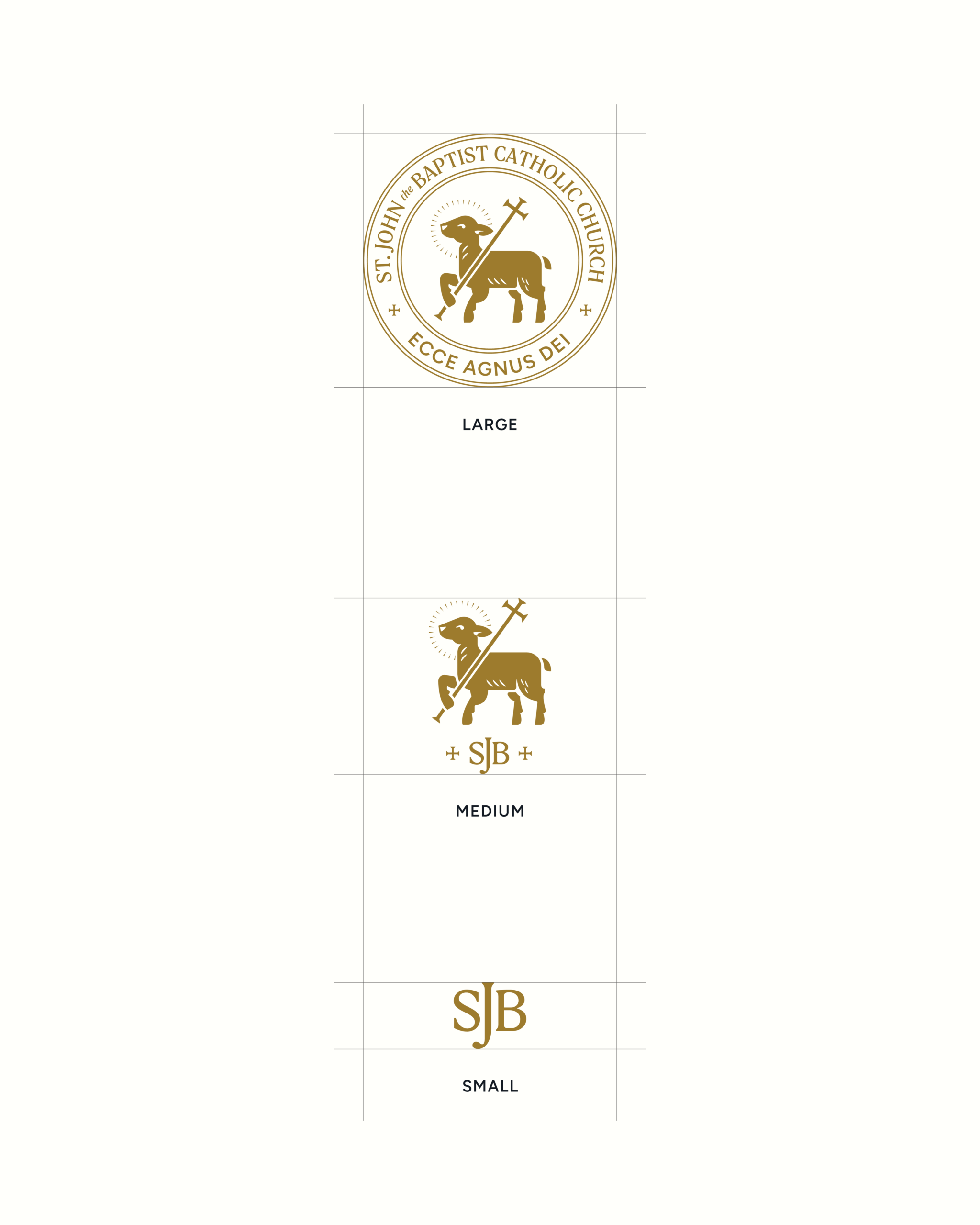
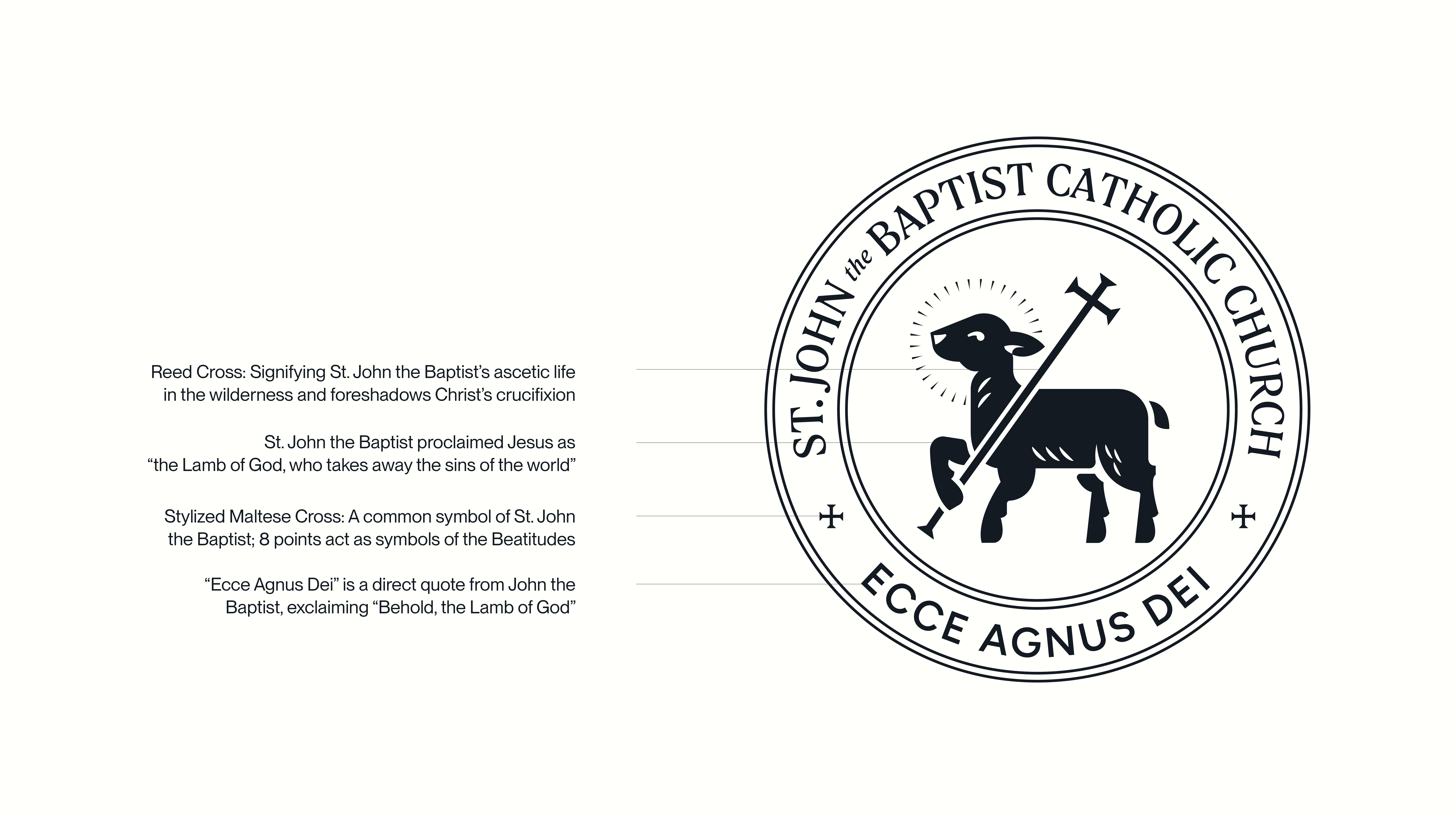
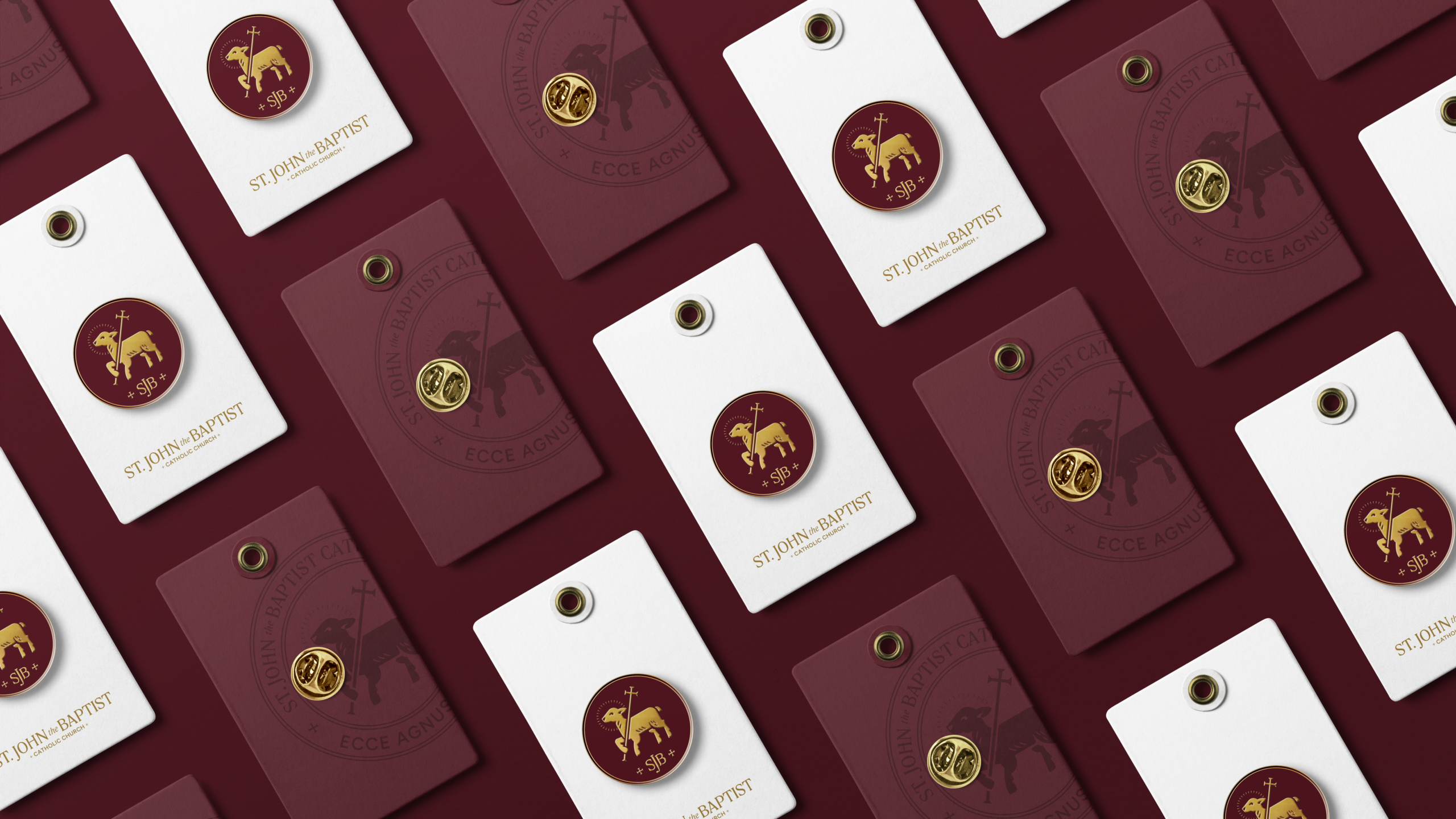
Conversations with parish leadership and their branding committee shaped the details. Symbols were refined and simplified so they could be understood and reproduced at any size. The Lamb became central, tied to John the Baptist’s role in pointing to Christ, while the reed cross reinforced that story. Elements were reduced, combined, and tested to ensure the system felt intentional rather than assembled.
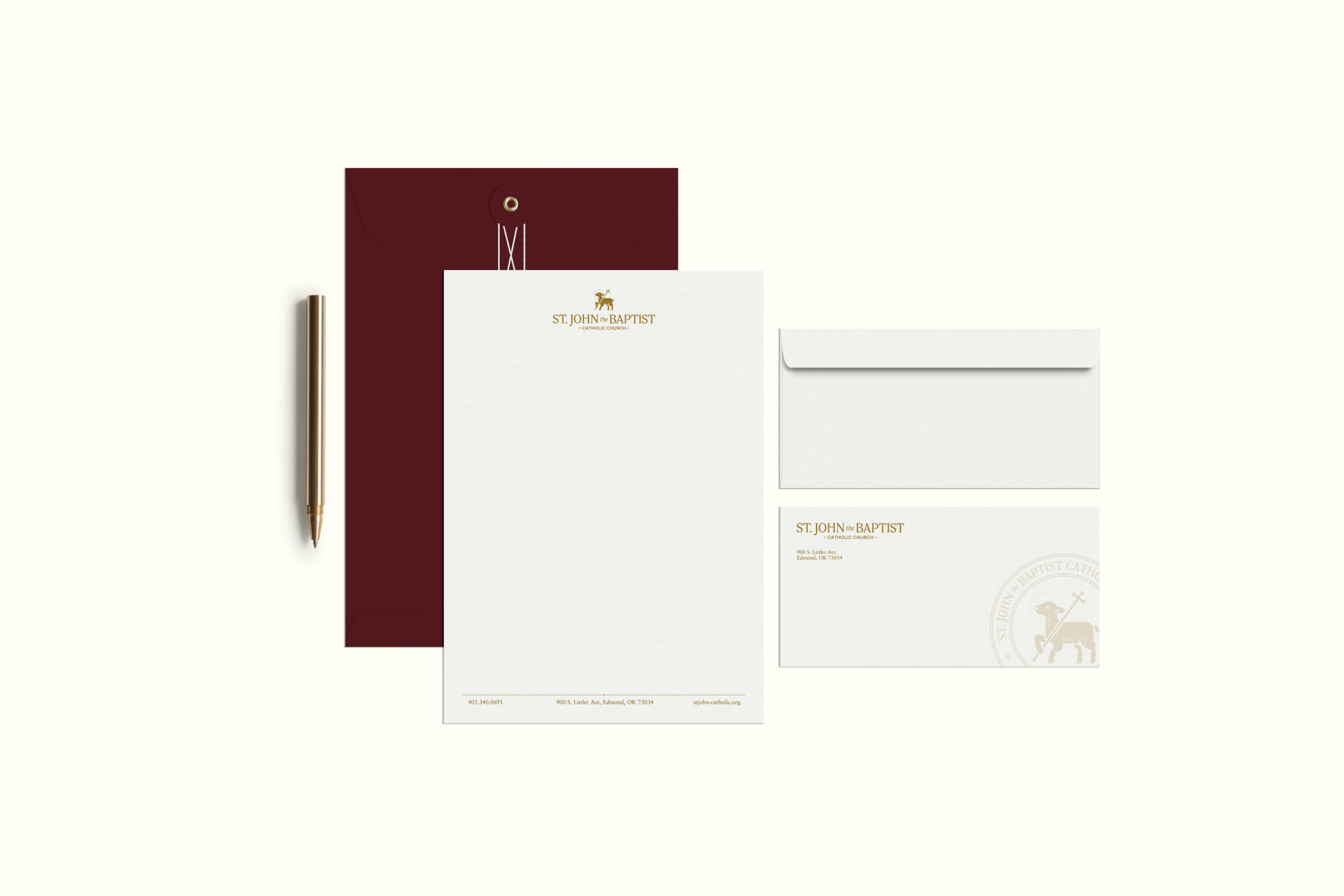
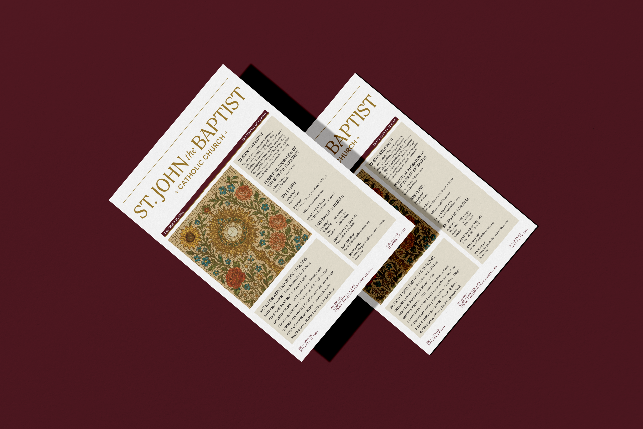
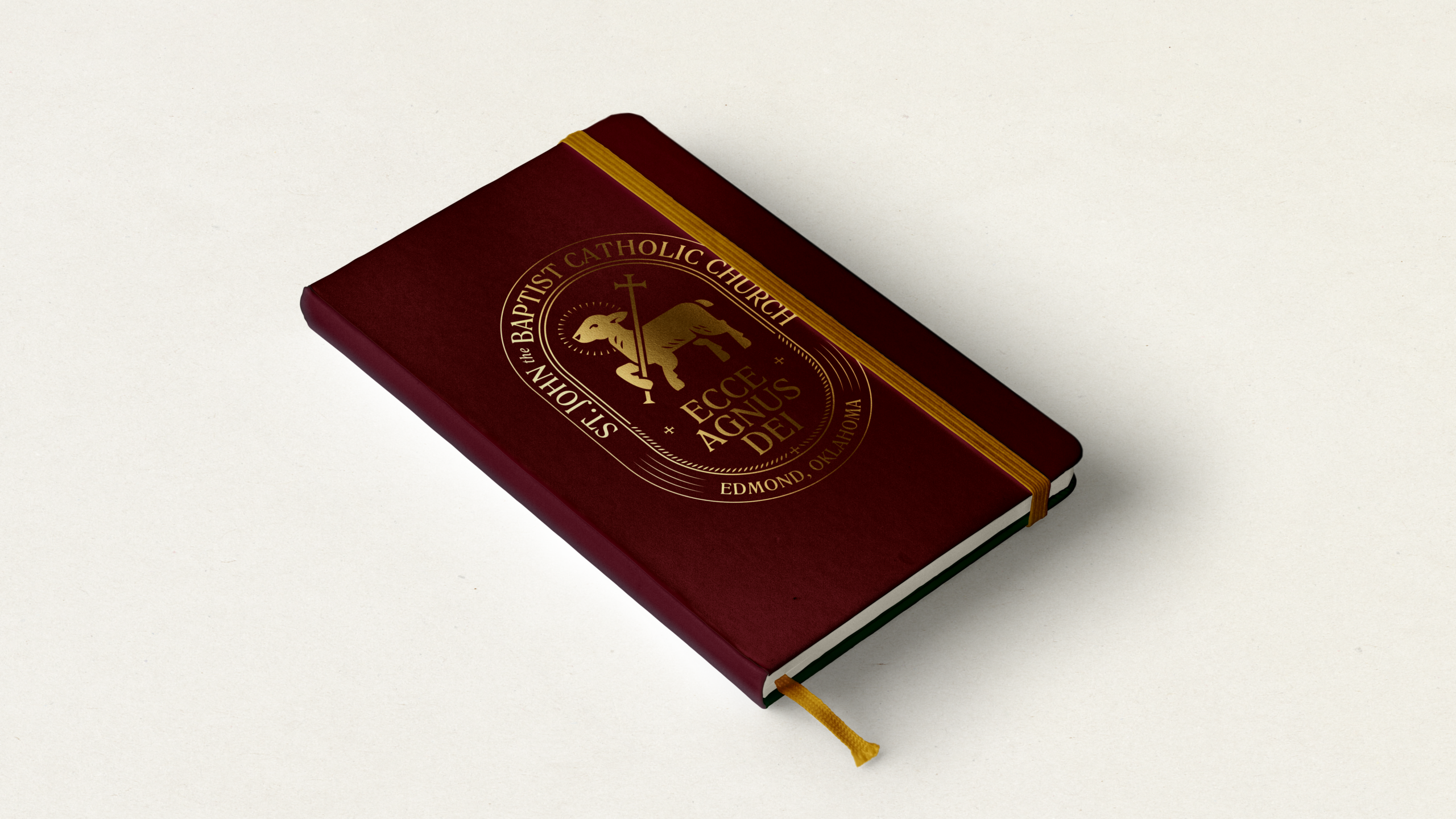
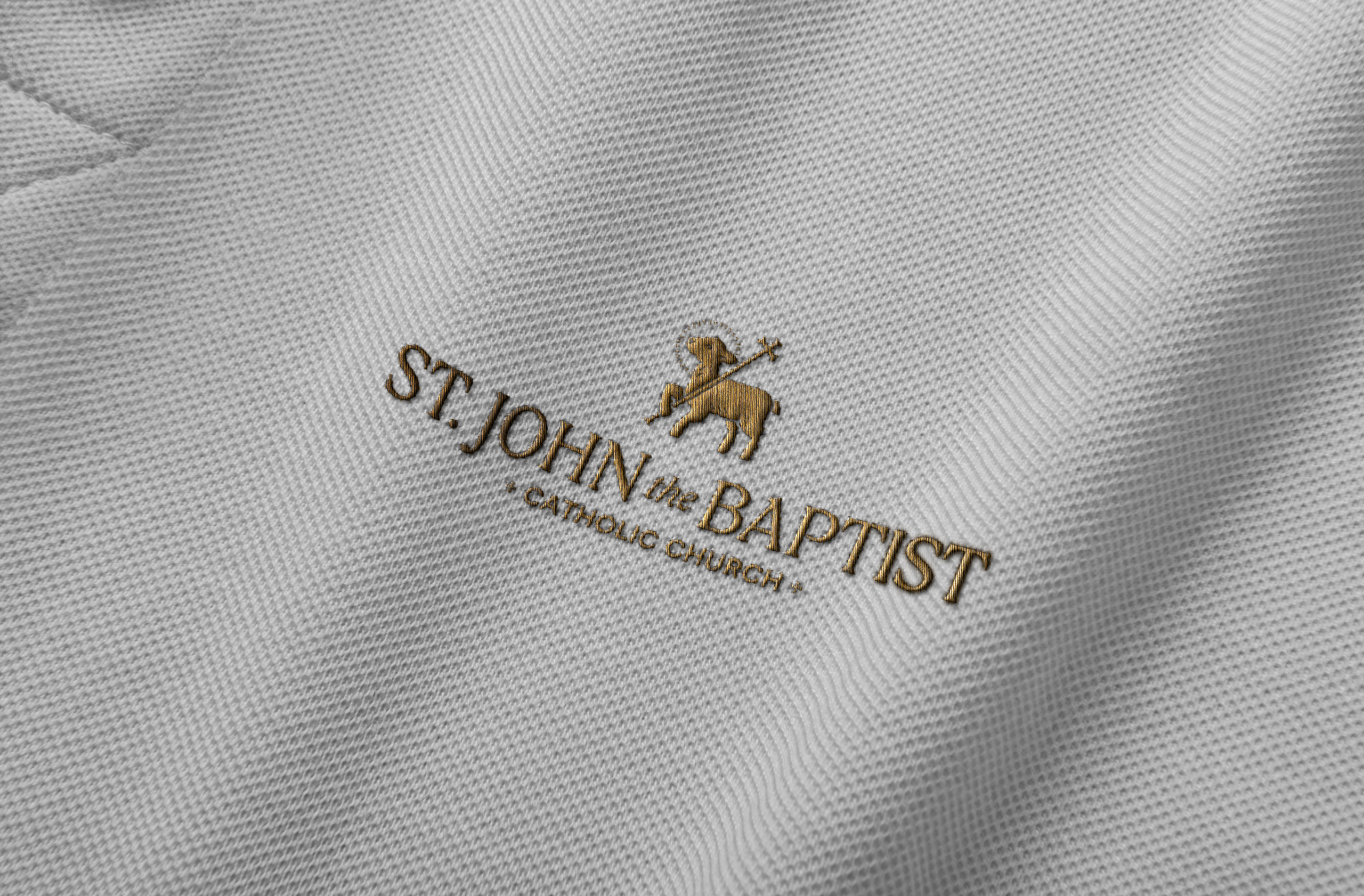
School Identity
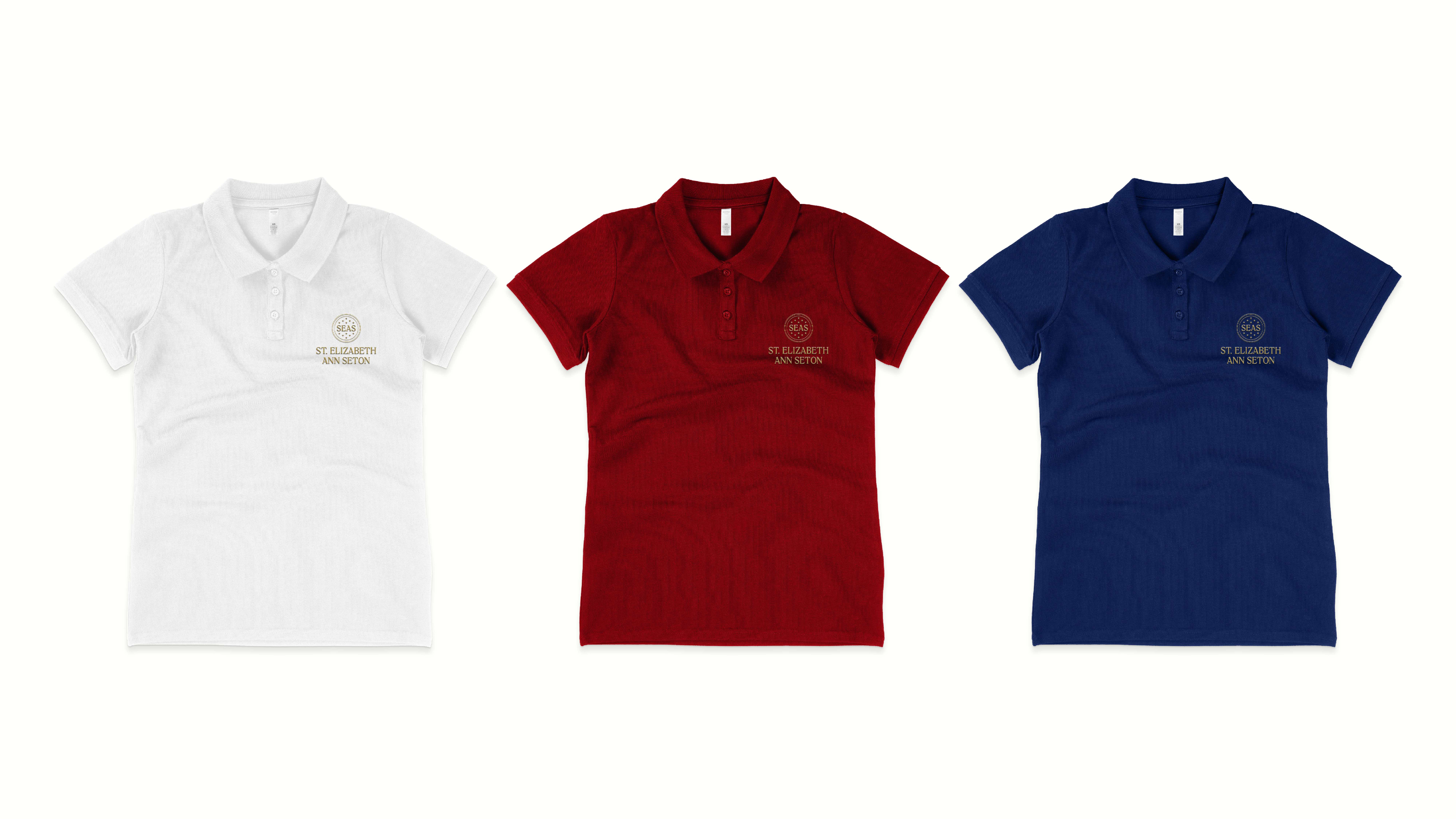
Alongside the church, a companion identity was developed for St. Elizabeth Ann Seton Catholic School. Built from the same framework, it incorporates its own references to education and Marian devotion while remaining visually connected to the parish. The result is a cohesive brand system that reflects the community’s scale, clarity, and character.