Be The Change
Be The Change
Overview
Be the Change provided outreach, support and social services to some of the more marginalized people, including at-risk youth and the homeless, until mid-2019. When we engaged with them for brand exploration, we quickly learned that their donors and the recipients of their services were responsive to contrasting messages and images, so our branding process had to demonstrate need and urgency to their donors, but hope and trustworthiness with the people they help.
Award-winning
- ADDY Public Service Collateral

How We Helped
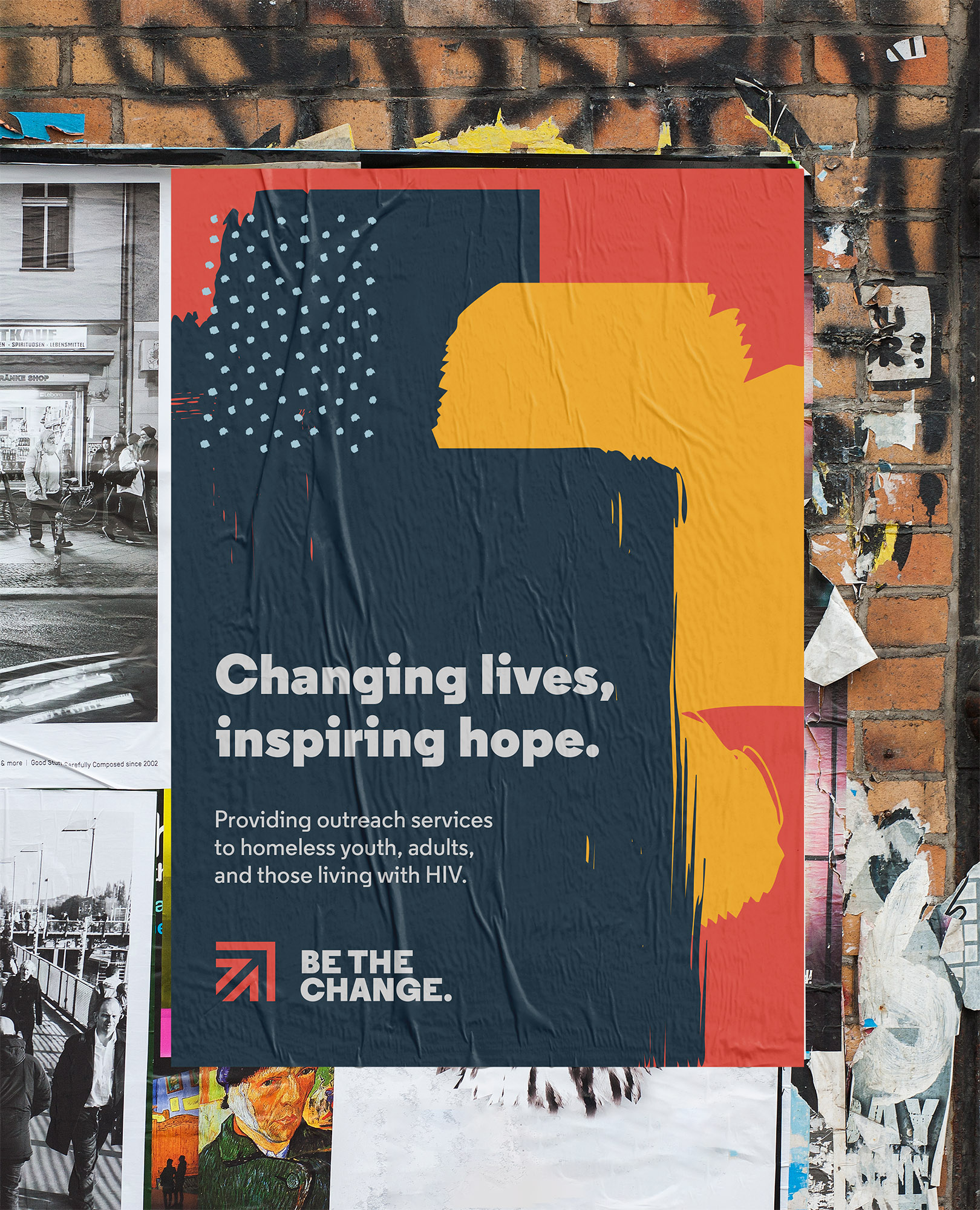
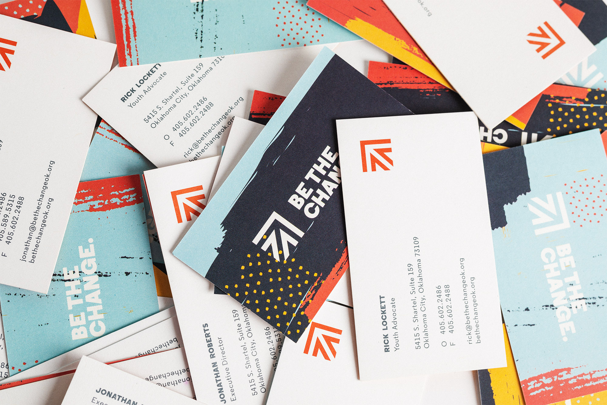
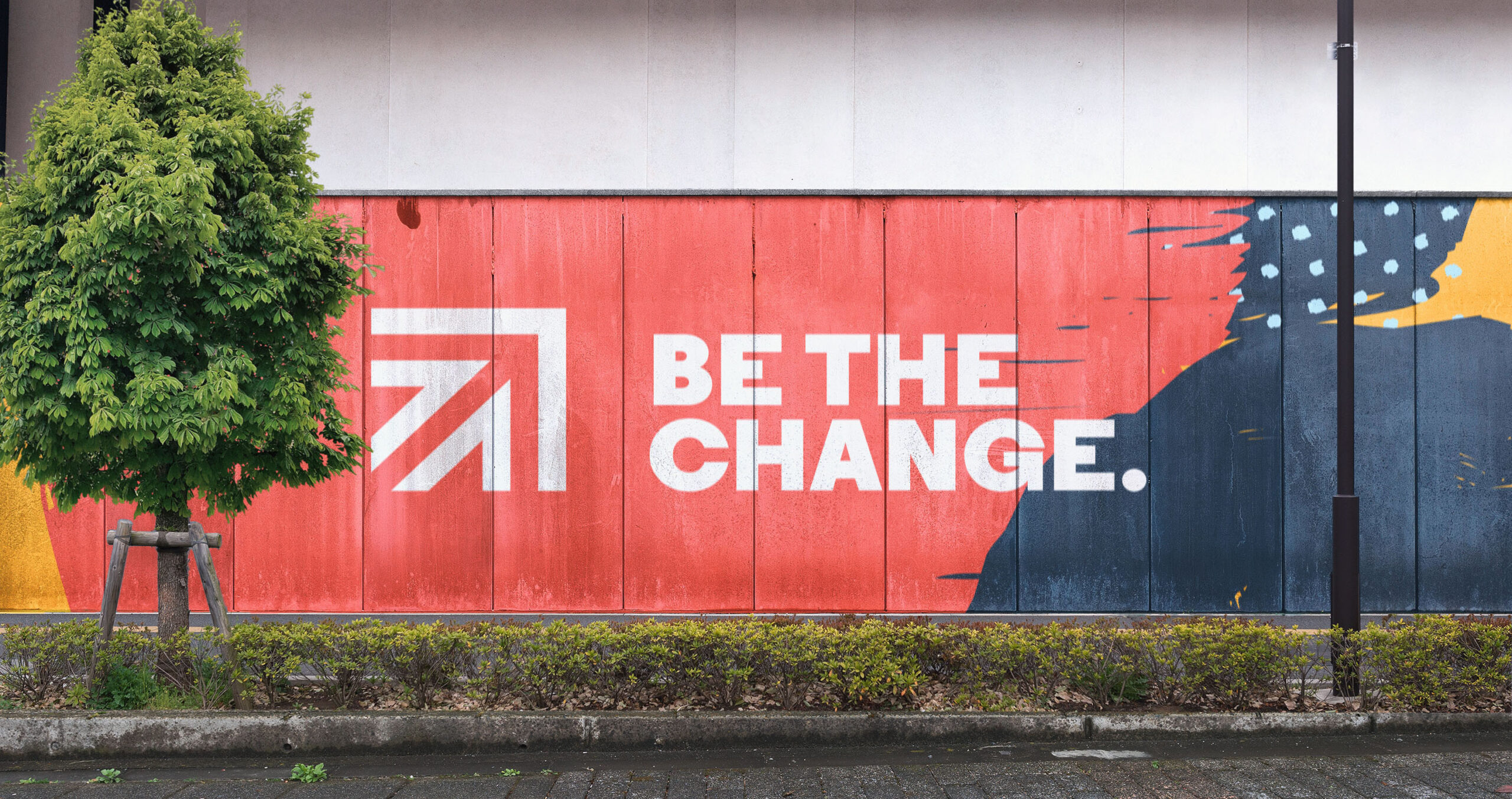
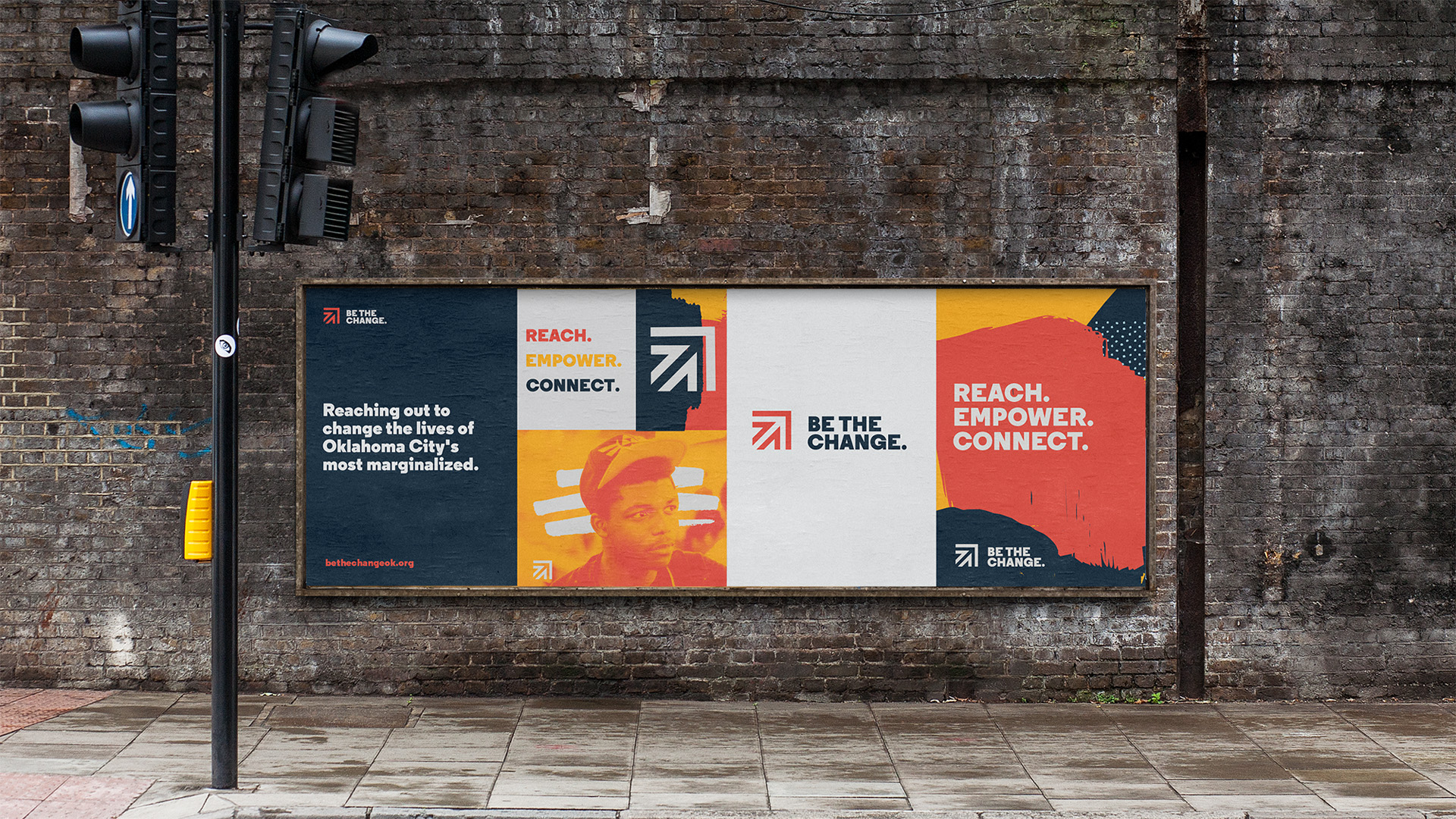
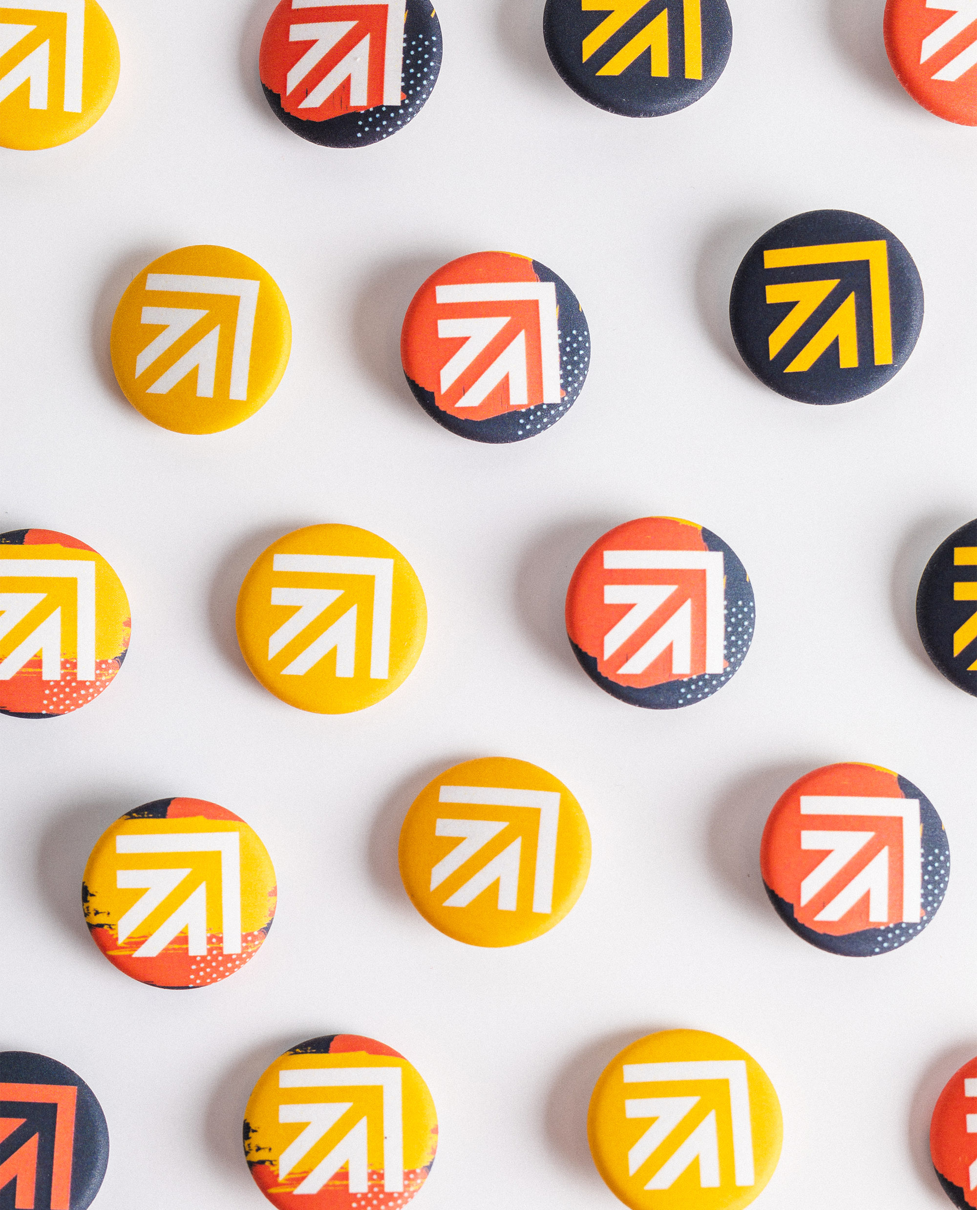
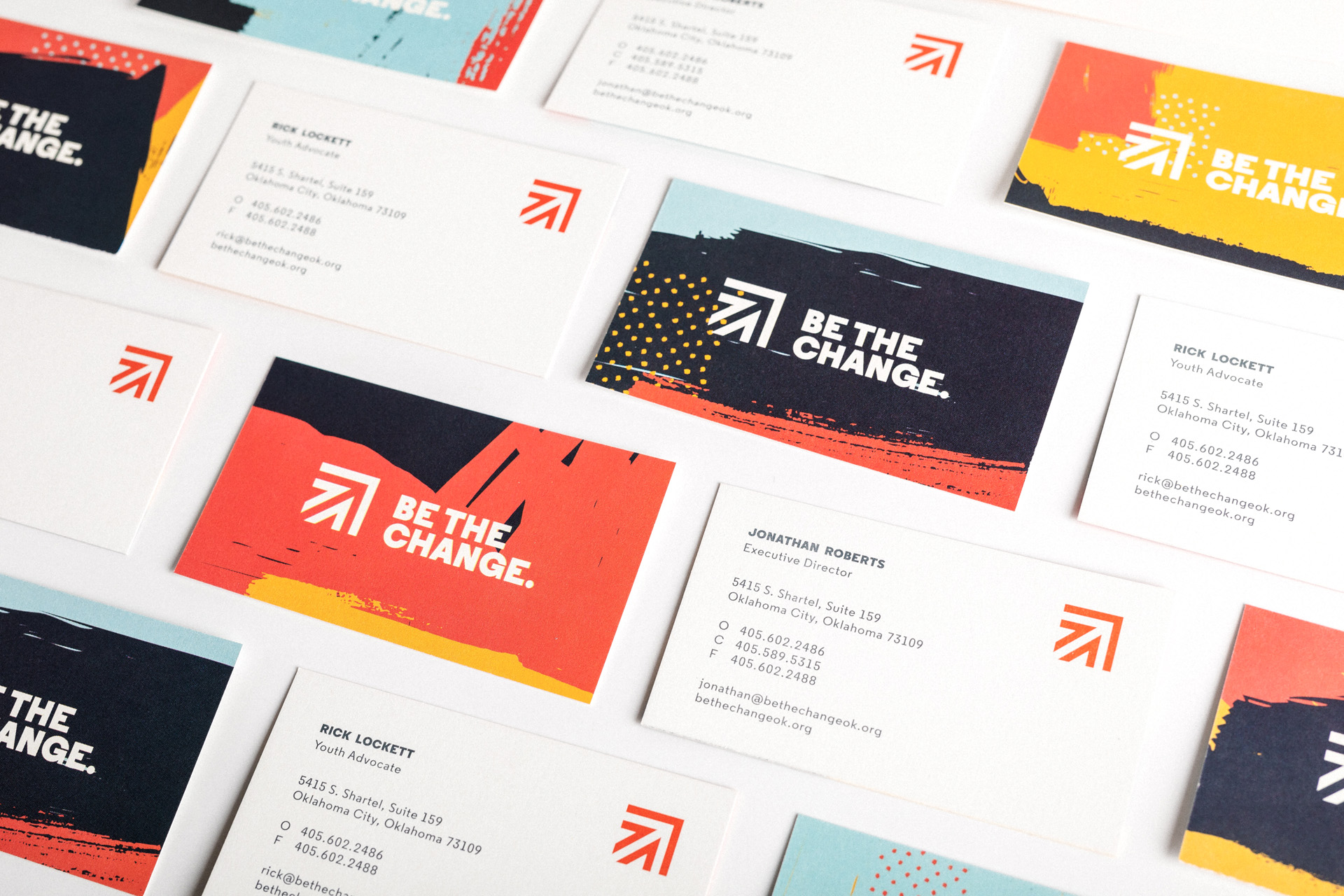
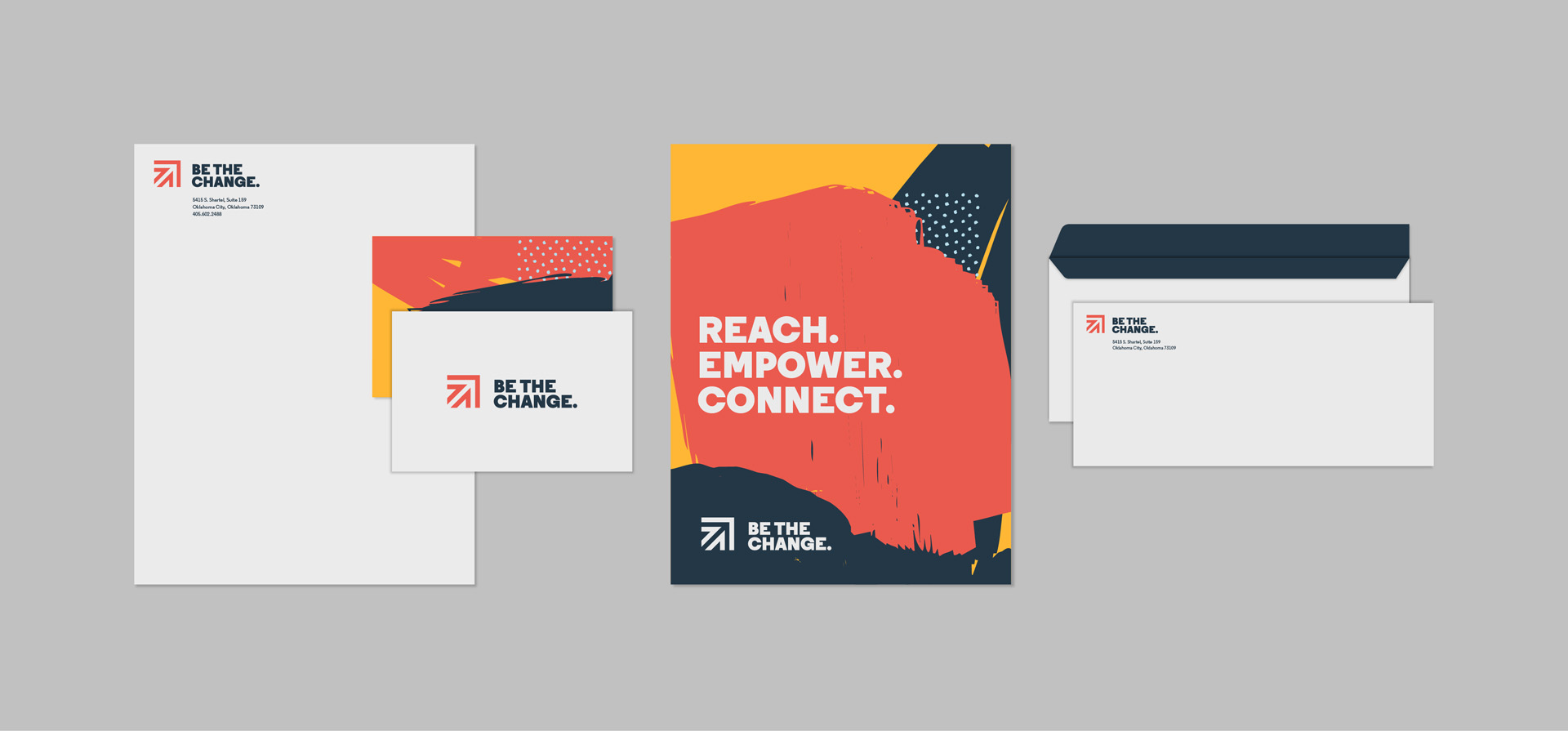
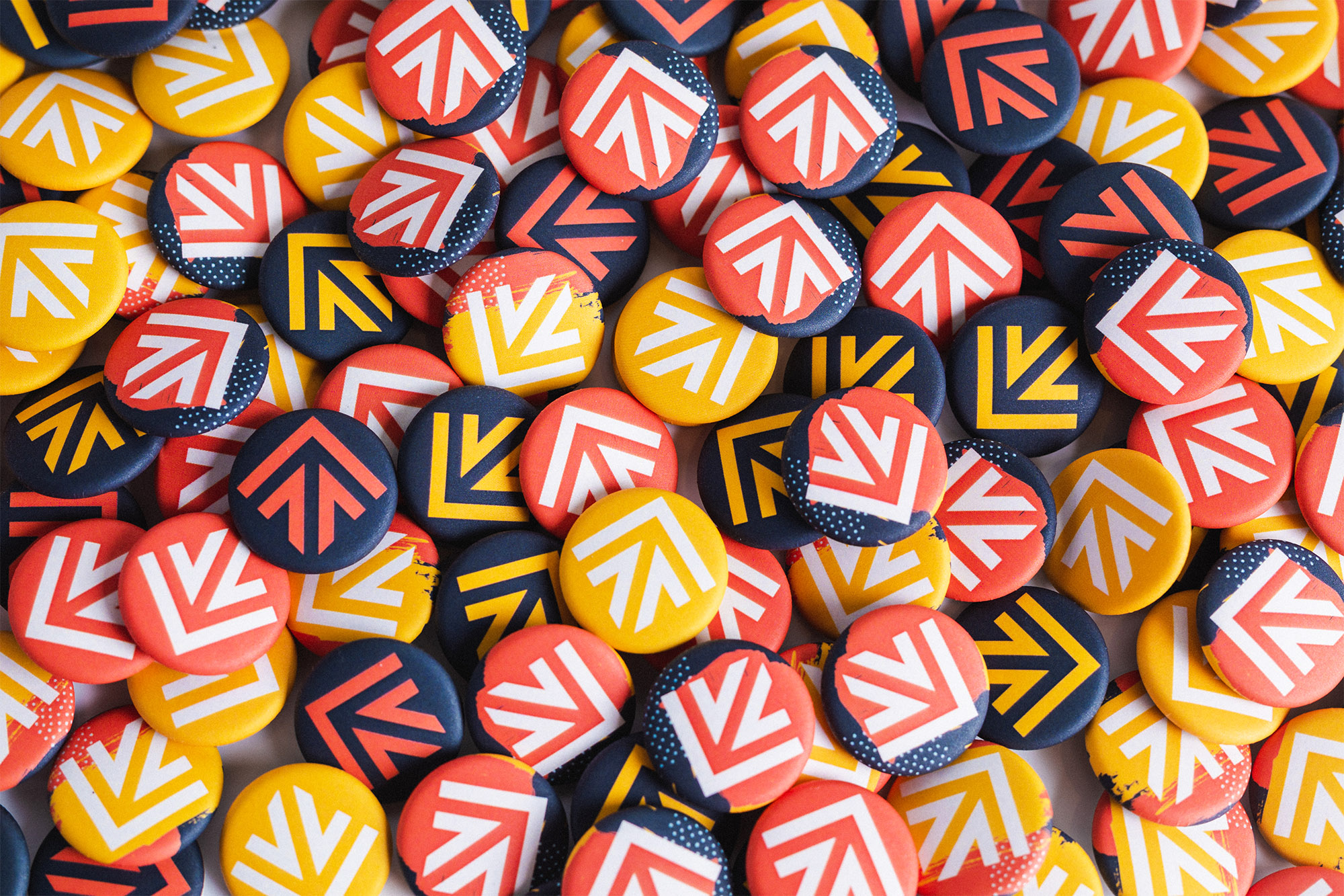
We created a brand that balanced professional and youthful tones, established trustworthiness and familiarity without sacrificing vibrancy. We used color to show energy, positivity and whimsy, and built in familiar symmetry and shapes to establish cohesion and consistency. The icon communicates forward and upward progress, momentum and hope. We combined various brush stroke combinations to create a brand that conveys diversity, inclusivity and collaboration, and with seemingly infinite shapes, placements and patterns, we communicate infinite possibilities.
Unity Through Diversity.
